The COVID-19 pandemic will be remembered for many things, most of them very bad indeed. One small positive, however, is that this has been one of the first truly global events of the data visualisation era. In the last few years, the art of distilling huge and complex data into a form that is both visually arresting and informative has become a hugely mainstream activity. Most major news organisations now employ dedicated data visualisation teams and publications such as the Financial Times and New York Times have consistently found innovative and engaging ways of illustrating the spread and impact of coronavirus across the globe. When bad news looks this beautiful, sometimes it’s hard to avoid endless doomscrolling on Twitter.
Back in March I vowed to myself that I wouldn’t get involved in drawing graphs related to COVID. The Financial Times’ John Burn-Murdoch had already drawn every graph that could ever be drawn, or so it seemed. But then a colleague pointed out that nobody had taken the published data on cases of the virus at Local Authority level in England, and combined it with data on deprivation to see whether cases were rising faster in more deprived areas. My primary research interest is in understanding how different public health policies can improve or exacerbate inequalities in health, so this was too interesting a question not to try and answer. As it turned out there wasn’t any clear pattern, but that didn’t matter, I was off the wagon.
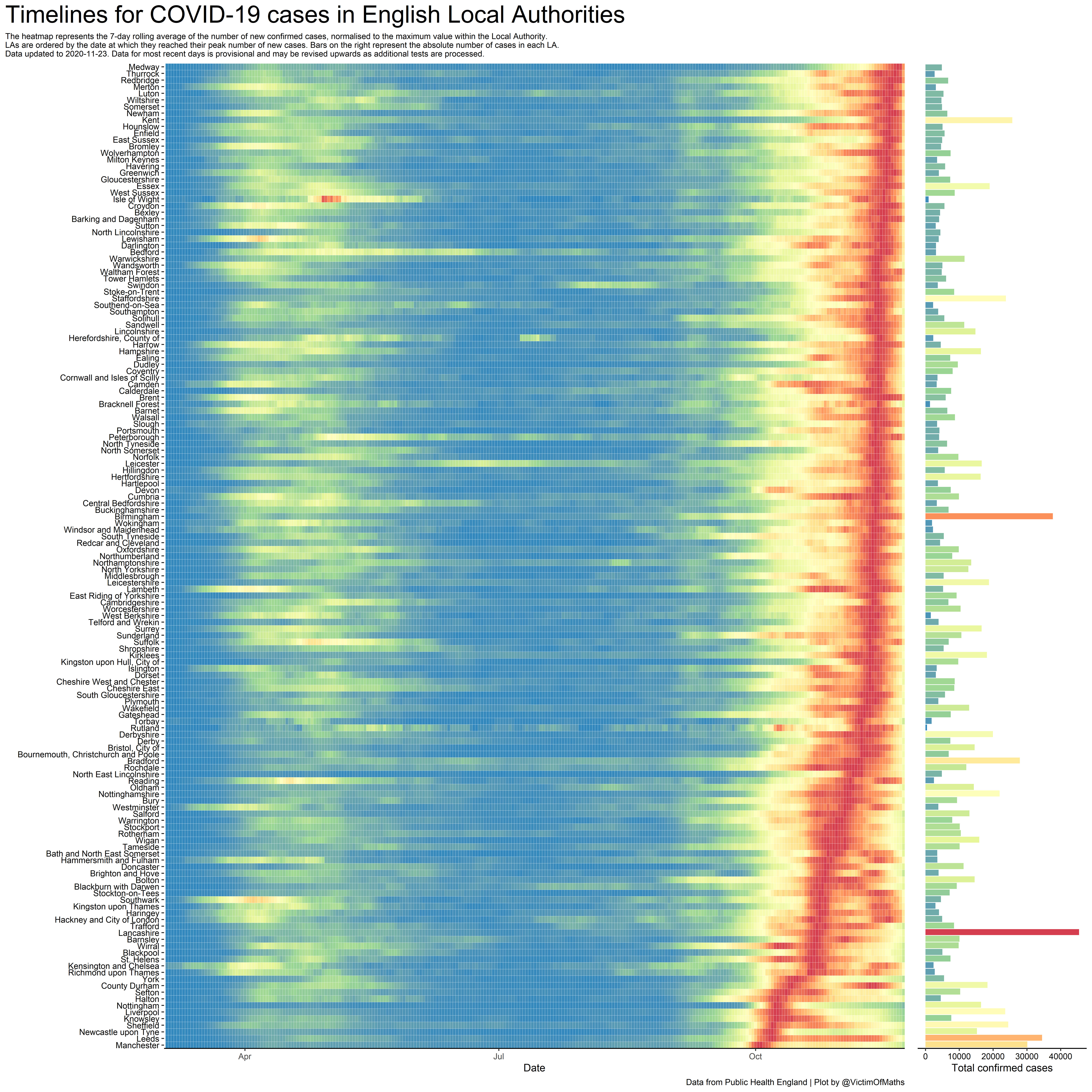
One thing I found interesting was trying to understand how the virus had spread across the country and how the trajectory of case numbers varied between Local Authorities. Public Health England were publishing regular maps showing recent case numbers, but these didn’t capture the temporal patterns in their spread. I’ve always liked heatmaps as a way of showing evolving patterns over time, so I started to experiment with various plots to see if these made things any clearer. After much experimentation and drawing inspiration from some excellent US State-level plots produced by Marco Piani on Twitter, I settled on the version you see here, in which the time series for each Local Authority is normalised so that the day with the highest number of cases in that Local Authority is the same shade of dark red. While this makes comparisons between areas harder, it allows you to see the trajectory of cases, and whether they are rising or falling, equally clearly, rather than only being able to see what is going on in the small number of Local Authorities that have seen the biggest outbreaks. In order to maintain some sense of comparability between areas, the total number of confirmed cases are illustrated as an extra set of bars on the right hand side. This means that a Local Authority with a peak number of cases in the past few days and a large number of confirmed cases is somewhere we should be really worried about.
The final question was how to order the Local Authorities. Ordering from North to South allows you to see some interesting geographical patterns, but doesn’t capture East-West variation. Alphabetical ordering makes it easy for people to look up Local Authorities of interest, but looks quite chaotic. In the end I chose to order areas by the data at which they recorded the peak number of cases. This allows you to immediately see where the current ‘hot spots’ of infection are. As a side benefit the resulting snaking red line running up the plot is rather visually appealing.
So what does this plot tell us? There are a lot of stories hidden within it and as time passes these have evolved. In early versions, you could clearly see the virus first peaking in London, before spreading out across the country. With the emergence of the ‘second wave’ of the virus in the Autumn, much higher levels of testing compared to the Spring means that these subtle patterns have been largely wiped out by a red wall, like a barrier of flame tearing across the right-hand side of the image. As I write this, case numbers are finally starting to fall in many places, and this plot highlights that the peak number of cases in many of the worst-affected areas such as Manchester, Newcastle, Sheffield and Liverpool actually happened a fair bit earlier than most of the rest of the country, where cases are only now starting to come down.
This way of looking at the data also highlights an interesting feature that would be hard to spot otherwise – the rather strange simultaneity in the rise in cases across almost the whole of England right at the start of September. The obvious explanation for this is that it is related to schools going back, but you can see the same effect at the same time in Scotland, where schools went back in mid-August. Ultimately, visualisations like this can help to answer questions about data, but they can also raise just as many new questions. Which is as it should be.
This visualisation was created in R using publicly available data from the government’s coronavirus dashboard. The code to create it can be found on GitHub along with a wide range of other COVID-related plots and analysis.
This work was supported by the SIPHER Consortium (https://sipher.ac.uk/), part of the UK Prevention Research Partnership (MR/S037578/1), an initiative funded by UK Research and Innovation Councils, the Department of Health and Social Care (England) and the UK devolved administrations, and leading health research charities. Weblink: https://ukprp.org/
Colin Angus, Senior Research Fellow, School of Health and Related Research, University of Sheffield, Regent Court, Regent Street, Sheffield, S1 4DA. Email c.r.angus@sheffield.ac.uk